WebCompat Tale: Touching Clickable Things
Did you know your finger is larger than one pixel? I mean, sure, your physical finger should always be larger than one pixel, unless your screen has a really low resolution. But did you know that when using Firefox for Android, your finger is actually 6x7 millimeters large? Now you do!
Unlike a pixel-perfect input device like a mouse or even a laptop’s trackpad, your finger is weird. Not only is it all soft and squishy, it also actively obstructs your view when touching things on the screen. When you use a web browser and want to click on a link, it is surprisingly difficult to hit it accurately with the center of your fingertip, which is what your touchscreen driver sends to the browser. To help you out, your friendly Firefox for Android helps you out by slightly enlarging the “touch point”.
Usually, this works fine and is completely transparent to users. Sometimes, however, it breaks things.
Here is an example of a clever CSS-only implementation of a menu with collapsible sub-navigation that I extracted from an actual Web Compatibility bug report I looked at earlier. Please do not actually use this, this is broken by design to make a point. :) Purely visual CSS declarations have been omitted for brevity.
Source:
<style>
#menu-demo li ul {
display: none;
}
#menu-demo li:hover ul {
display: block;
}
</style>
<section id="menu-demo">
<ul>
<li><a href="#menu-demo">One</a></li>
<li>
<span>Two with Subnav</span>
<ul>
<li><a href="#menu-demo">Two > One</a></li>
<li><a href="#menu-demo">Two > Two</a></li>
</ul>
</li>
<li><a href="#menu-demo">Three</a></li>
</ul>
</section>Result:
Now, just imagine that on Desktop, this is a horizontal menu and not a vertical list, but I’m too lazy to write media queries right now. It works fine on Desktop. However, if you try this in Firefox for Android, you will find that it’s pretty much impossible to select the second entry, and you will just hit “One” or “Three” most of the time.
To understand what’s going on here, we have to talk about two things: the larger “finger radius” I explained earlier, and the rules by which Firefox detects the element the user probably wanted to click on.
Touch Point expansion
The current touch point expansion settings, as set by the ui.mouse.radius.* preferences in about:config, are: 5mm to the top; 3mm to the left; 3mm to the right; 2mm to the bottom. There probably is a good reason why the top/bottom expansion is asymmetric, and I assume this has something to do with viewing angles or how your finger is shaped, but I actually don’t know.
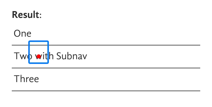
To visualize this, I prepared a little annotated screenshot of how this “looks like” on my testing Android device:

The red dot marks the center of the touch point, the blue outline marks the area as expanded by Firefox for Android. As you can see, the expanded touch area covers part of the previous menu item, “One”. If you’d try to touch lower on the item, then the bottom expansion will start to cover parts of the “Three” item. In this example, you have a 9px window to actually hit “Two with Subnav”. On my device, that’s roughly 0.9mm. Good luck with that!
With this expansion in mind, you might wonder why you’re not hitting the wrong items all the time. Fair question.
”Clickable” elements
Firefox doesn’t just click on every element inside this expanded area. Instead, Firefox tries to find the “clickable element closest to the original touch point”. If all three <li>s contained links, then this wouldn’t be an issue: links are clickable elements, and “Two with Subnav” would, without a doubt, be the closest. However, in this example, it’s not a link, and then the rules are a little bit more complicated.
Things Firefox considers “clickable” for the purpose of finding the right element:
<a>s.<button>,<input>,<select>,<textarea>,<label>, and<iframe>.- Elements with JavaScript listeners for:
click,mousedown,mouseuptouchstart,touchendpointerdown,pointerup
- Elements with
contenteditable="true". - Elements with
role="button". - Elements with
cursor: pointerassigned via CSS.
Unfortunately, none of the rules above are true for the “Two with Subnav” element in the example above. And this means that the “closest clickable element” to the touch point here is, well, “One”. And so, Firefox dispatches the click event to that one.
Matching any of the conditions, even simply changing the cursor via CSS, would provide the browser with enough context to do “the right thing” here.
Conclusion
This issue, once again, is one of those cases where I do not yet have a satisfying outcome. I wrote a message to the site’s authors, but given the site is based on a Joomla template from 2013, I do not have high hopes here. As for changes inside Firefox, we could treat elements with :hover styling and mouseover listeners as “clickable”, and I filed a bug to suggest as much, but I’m not yet convinced this is the right thing to do. From what I can tell, neither Chrome nor Safari do a similar expansion, so just dropping it from Firefox is another idea. But I kinda like the way it makes things better 99.9% of the time.
In any case, this serves as yet another reminder of why having semantically correct markup is important. Not only do attributes like role="button" on clickable elements help out anyone relying on accessibility features and tooling, browsers also depend on these kinds of hints. Use the tools you have, there’s a reason why the role attribute is part of the web. :)
Update from 2021-08-25
Good news! The developer responsible for the site has responded, and they did fix the issue by adding role="button" to the links. Huge success!