Overengineering Coffee Bean Storage
Coffee. Good stuff. Amongst the people who consume it, there are three groups: those who drink it for the caffeine, those who drink it for the taste, and those who make coffee their hobby. As you can tell from the title of this post, I am very far in the latter category. Having coffee as a hobby is fun: you get to taste delicious things, and there are endless possibilities for overengineering every single aspect of it, so what’s there not to love.
One thing that always feels more complicated than it should be is the logistics around handling coffee beans. Buying and consuming those super dark roasts from the shelves of your local supermarket is easy. Things become a lot more complicated as soon as you buy fresh, lightly roasted specialty coffee beans.
You want your coffee to be fresh, but it’s actually possible for beans to be too fresh to consume. During roasting, a lot of CO2 builds up inside the beans, so you want to give them two to four weeks to degas after roasting. However, after that, you want to consume the beans within a month or so, or they’ll lose a lot of their finer flavors. You can prolong the life of your beans significantly by freezing them after the degassing period, but then you somehow have to keep track of what beans are currently inside your freezer, when they went into the freezer, …
Keeping track of which beans are currently in any given state and for how long is a bit of a challenge all by itself. But that’s not all! I usually have more than one kind of bean “ready for consumption”. In most cases, there is at least one decaf coffee and two different regulars - usually one naturally processed and one washed coffee, just for some variety. If you mix up storage containers, you’ll have a very confusing taste experience and maybe even a bad night. Knowing which bean is in which container isn’t all there is to it, though. Since I’m not only brewing drip coffee, but also pulling Espresso shots, I need a way to keep track of the right grind settings and brew ratios for each bean. Properly dialing in Espresso is a bit of a science itself, and once you’re done for a specific bean, it’s pretty much required to write those things down. Eyeballing doesn’t work, and the values are different for each type of bean.
I used to keep track of all this data in the way you would expect: inside a giant spreadsheet document, and I labeled my containers using a dry-erase marker. However, the problem with spreadsheets is that they become very messy when they contain a lot of data, and there is a lot of potential for inconsistent data or just confusing states. What do you do if you have multiple batches of the same bean? How do you properly sync the data between devices and have it accessible and editable on both desktop computers and smartphones?
At the time of writing this, I consumed 58 different beans, and all of them had one or more rows in my spreadsheet, and the number of columns was larger than I am willing to admit. I also screwed up my data more than once by trying to edit this large spreadsheet on a tiny touchscreen display, and I had a desync issue between my spreadsheet, the dry-erase board, and reality more than once. So clearly, this solution wasn’t working!
So, my plan was to develop both software and hardware to solve this: an application that allows me to keep track of all the beans I ever consume, and a nice solution for using that data to have my storage containers labeled. In detail, the ideas and requirements I had were:
Software:
- Can be a relatively simple application that only has list-views and edit-views. There is no point in spending time designing a “view” view if I just want to treat this as a replacement for a spreadsheet.
- The application should be deployed on a server running in my home network, so I can access it from all devices.
- The application should make it easy to keep track of “currently active” beans (i.e., all the things I described earlier, including degasing batches and frozen stuff), but it should also keep a history of everything I ever consumed if I want to look something up.
Hardware:
- I had no interest in designing my own container. I like the Fellow Atmos vacuum canisters, and I wanted to use them.
- I did not want to affix anything to the containers themselves, I wanted to be able to throw them into water for cleaning.
- I don’t want to interact with the storage unit itself to change the data, and I also don’t want to plug stuff in. So the system has to be able to automatically fetch data over WiFi.
- I do not want to recharge those units every week, the battery should last one month, at least.
The Result
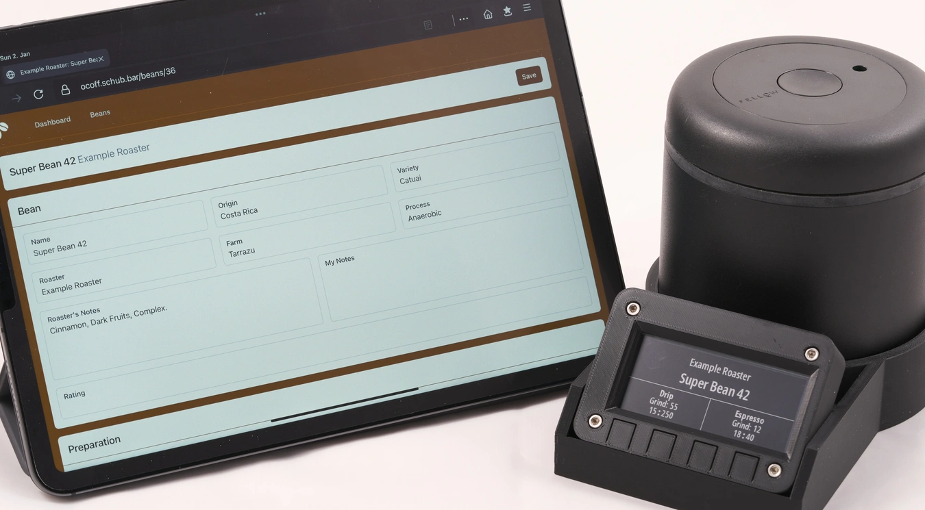
The application is a little web application that has a bunch of list views and a bunch of forms. There are two entities, beans and batches, and as you’d expect, a bean can have multiple batches. Most of the information is stored in the beans table, and the batches basically only contain a timeline of state changes for each batch. I won’t list every available, but if you’re curious, here are screenshots of the dashboard view, the bean view, and the batch view. It works well on mobile browsers, so I can edit the data directly in the kitchen on my smartphone.
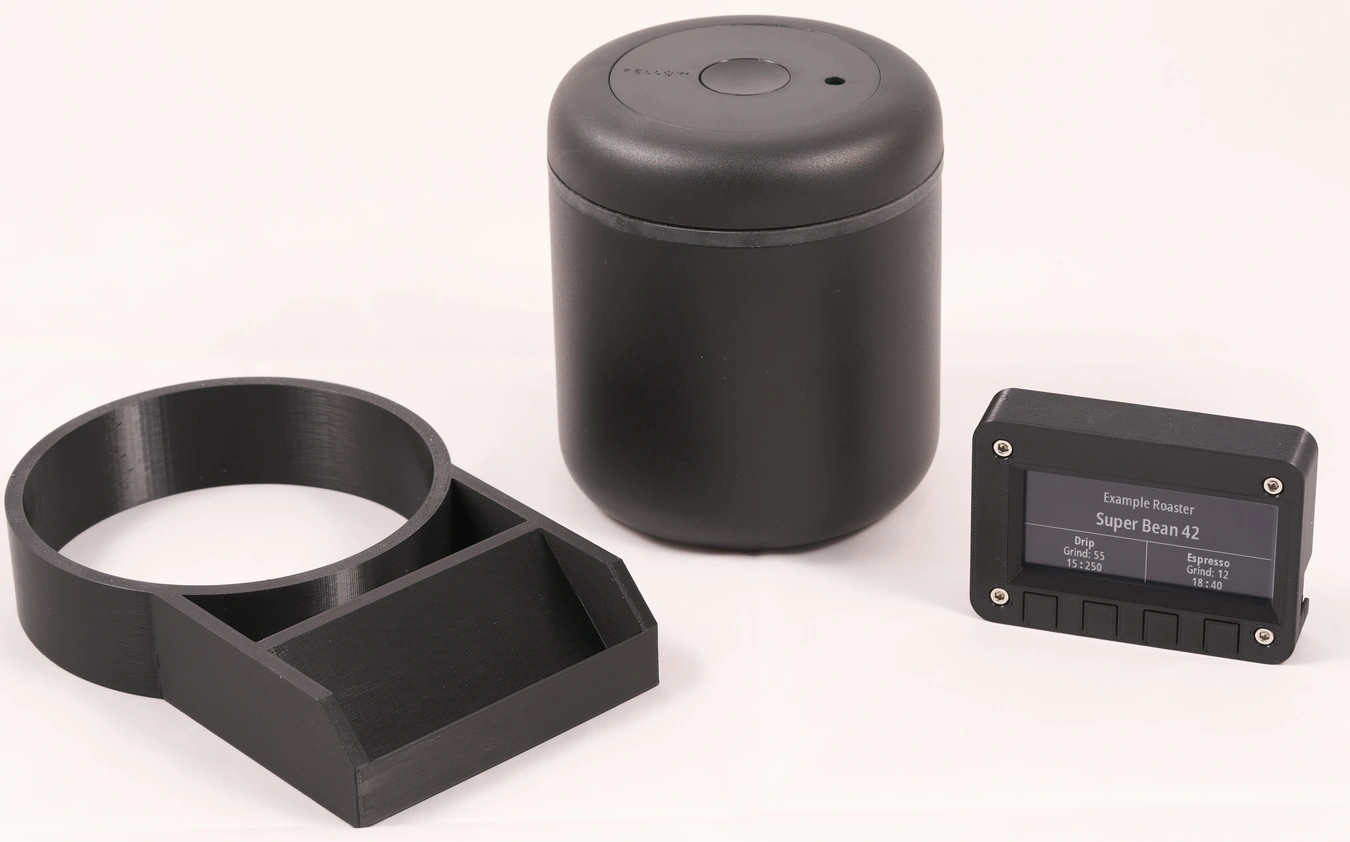
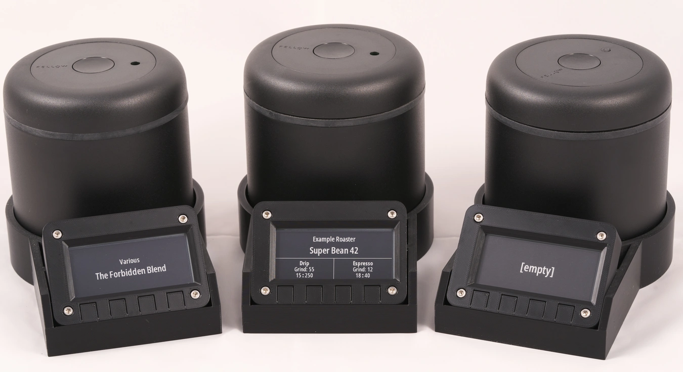
The hardware part is based around an E-Ink display attached to a WiFi-enabled microcontroller. It periodically fetches the data and displays it on the screen. I decided to show only the roaster, the bean name, and the grind and brew settings for each available brew type (I currently support the AeroPress, generic drip coffee, espresso, and generic immersion brews). The current setup survives a bit over 40 days between recharges, which is perfectly fine for me. The hardware is split into three distinct pieces: the container itself, a base that is more or less just a ring in which the container can stand, and a display unit that has its own case and is attached to the base by a magnet. This way, I’m not stuck with any particular implementation, and it is easy to switch parts out.
If you just wanted a brief overview, now is a good place to stop reading! But, if you want more details, continue.
Hardware
As mentioned, the hardware assembly consists of three individual parts:
I already mentioned that the storage containers here are Fellow Atmos vacuum canisters. There are many good things to say about that product, and while some folks sometimes have reliability issues, I had no problems in over a year, and I really like them. These containers work by pulling a low-pressure environment inside, and according to some testing by folks with lots of coffee knowledge, this generally results in the most stable taste profile over a relatively long time span.
I originally planned on designing my own hardware for the display unit from scratch. However, I eventually realized that I actually wanted to finish and use this project, so I decided against that. Designing my own hardware would have been months of work, and sourcing and testing parts is always a bit of a pain. Luckily for me, The folks at Adafruit came up with the product I need: The Adafruit MagTag. This is a small board designed around an ESP32-S2 (if you don’t know that chip: that’s basically a microcontroller with embedded WiFi), as well as a 2.9-inch E-Ink display.
Coming from Adafruit, this product has some pros and some cons. It is always amazing how good Adafruits software support is, and this results in you having a lot of choices in how to program this unit: You can go as high-level as using CircuitPython to build your firmware, but you can also use ESP-IDF if you want to go deep and write C code. It’s a lot of fun working with their boards. However, as this is designed as a general-purpose development board, there’s also a lot of hardware on it that I simply don’t need: RGB LEDs, buttons, an accelerometer, expansion slots, … all of that results in the unit being a bit larger than it needs to be. However, that’s still better than designing my own hardware, and to be fair, the price is amazing.
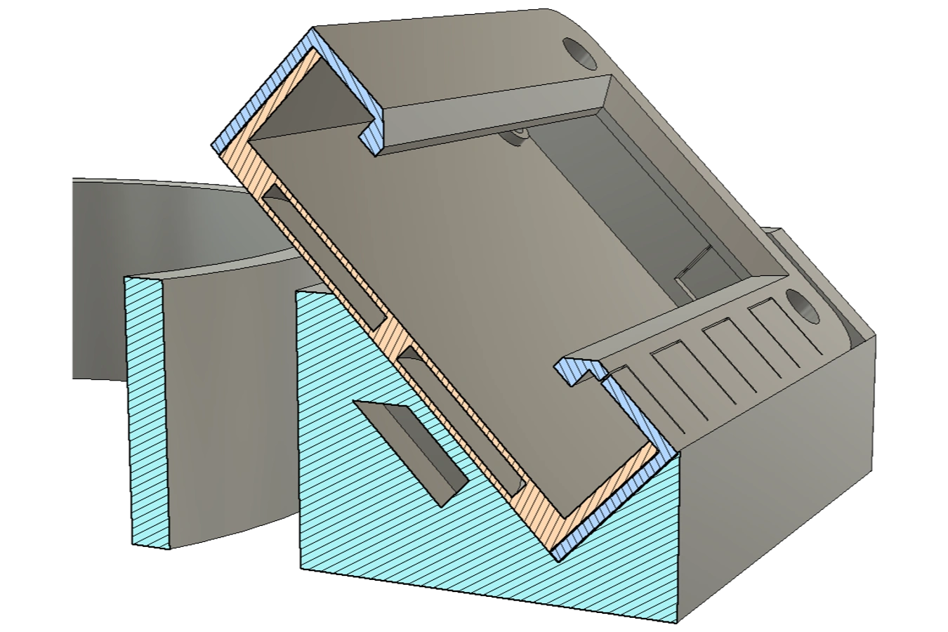
The base and the display case are both custom-designed, 3D-printed objects. I decided not to directly integrate the display into the case. While I could have saved quite a bit of material and time, I wanted the display modules to still be independent. If I ever want to use them for a different project, I already have a handy case! While the display would stay inside the base just with gravity alone, I also wanted to add a bit of everyone’s favorite magic: magnets.
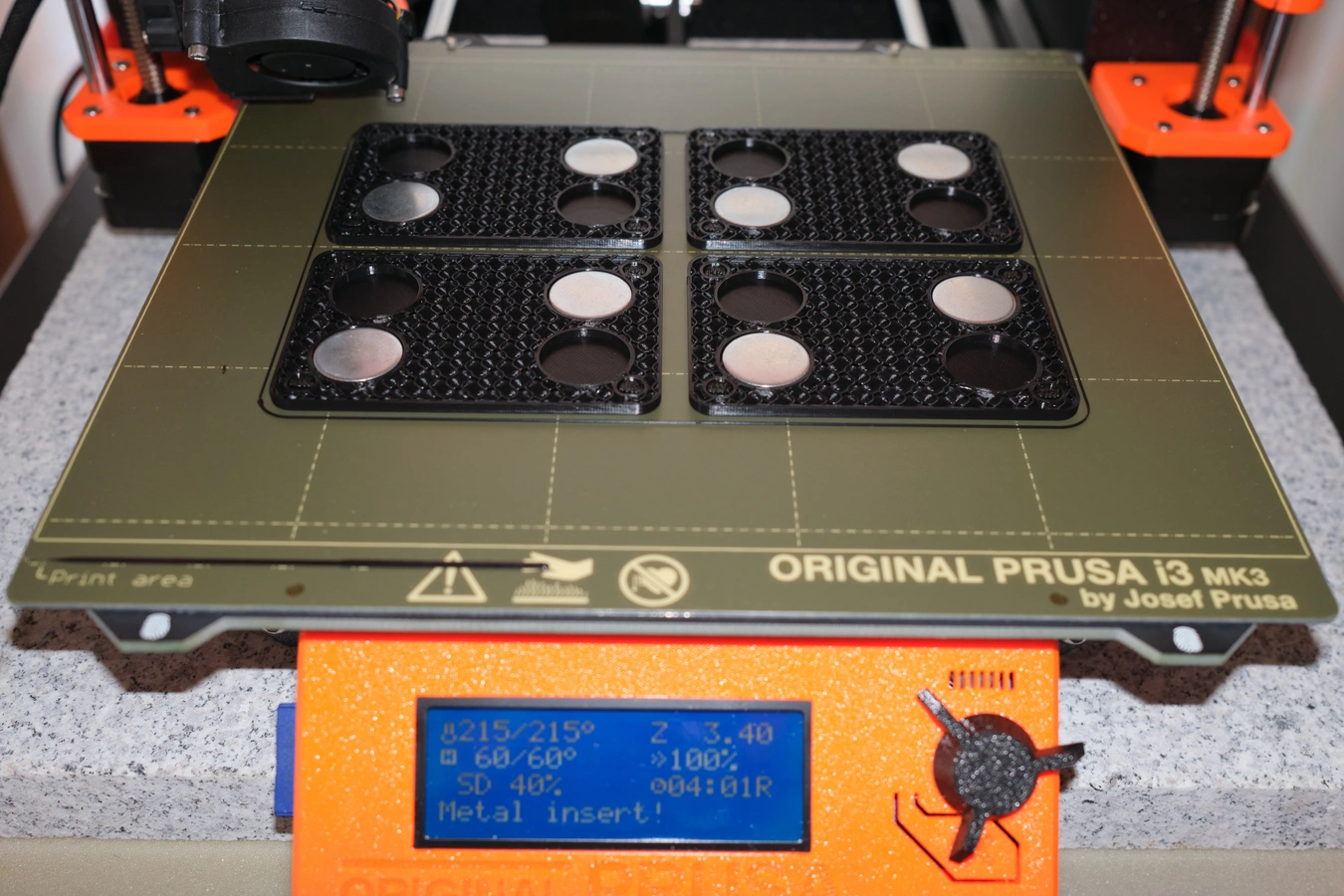
FDM 3D printing is kind of amazing for that: due to the objects being printed layer-by-layer, you can embed magnets and other objects into the print itself and have them be completely invisible from the outside. All you have to do is to design a cavity in your design where the object should be placed, and tell your printer to take a break before the layer covering the cavity is printed. In my case, the base has two magnets embedded, while the display case has four metal discs in its bottom plate. This way, the display itself contains no magnets and thus can be used in applications where magnets could cause issues.
I wanted to keep the display’s firmware as simple as possible. Laying out complex information in firmware is always a bit of a pain, so I decided to leave that task for my server application, where I have more capabilities and more resources at my disposal. The final firmware only boots up, fetches the image to display over the network, and then goes back to deep sleep. Since the display has a resolution of 296x128px, and each pixel can show four different shades of gray (so it’s a 2-bit color value), I can fit four pixels into 1 byte, and the whole display into 9.25 KiB. Having this uncompressed “bitmap” transferred over the network means it’s super easy to just bitmask and bitshift the bytes into the pixel buffer. The software section of this post will talk a bit more about how I actually generate the graphics.
After the data is fetched and displayed, the module goes into deep sleep for roughly 60 minutes. Even on very caffeinated days, I don’t pull shots faster than once per hour, so this delay is more than good enough, and it allows the unit to run for 40 days on a full charge. Initially, I planned on adding a “refresh now” feature based on the buttons on the front of the display board. Unfortunately, adding a pin-interrupt increases the deep sleep power usage by a lot, and would drop down the recharge intervals to less than 10 days.
In hindsight, I should have seen this coming. This isn’t my first project using an ESP8266 or ESP32, and I was aware of that limitation - I just didn’t think about it. The base has a lot of “dead space”, and it would have been easy to add a couple of large lithium cells and have that power transferred to the display unit with some pogo pins or something. I could have easily extended the battery life to multiple months, even with a button-based wakeup feature. However, after using this project for a bit, I am currently fine with only having a once-per-hour refresh. Maybe this is something I’ll improve in a future hardware revision, but I’m happy as-is.
Software
I wanted to write a web-based application as a slightly more polished alternative to a spreadsheet. I already have similar applications running on a server in my home network. In general, they’re simple applications that don’t even have their own authentication and are just protected by a TLS Client Certificate I auto-deploy to all my personal devices (and well, by being accessible from my network only). This works great, and is much more fun to use than a collection of spreadsheets and notes. I usually don’t add complex presentation views to those applications, there are just list-views, and clicking on a list item brings you directly into a form-view that shows all the data, but also allows you to edit without any further navigation.
Just as a reminder, here are screenshots of the dashboard view, the bean view, and the batch view. These kinds of applications work super well for me, and having the data stored in a database makes it a lot easier to re-use data or expand/change the applications in the future. I build these applications in one of those full-stack web frameworks, without fancy tech or front-end logic. Generally, I care more about UX design than the actual UI, and so I just use a CSS framework where I can copy-paste examples into something that works for me.
Most of the information, including notes about grind sizes and brew ratios, is stored in the Bean entity. Each bean then can have one or more Batch, which contains batch-related information like the roast date, batch-specific notes, and a history of that batch. Each batch can have one of six states: Ordered, Degassing, Frozen, Ready, In Container, Consumed. This allows me to filter the batches and build lists that make it easy to access what I want. Whenever I edit a Batch and its state changes, I write that change into a BatchTransitions table, which allows me to have a permanent history of each batch, and know at what point in time the batch was in any specific state. This is useful to answer questions like “when did I put this bag into the freezer?”, or “when is the degassing done?”. It also allows me to calculate the average of how long batches usually last, which helps me optimize my orders!
Unfortunately, the thing that was way more complex than I hoped it would be was generating the image for showing on the E-Ink display. I started my implementation using a generic image manipulation library, placing text elements manually on a canvas. Unfortunately, this approach is as painful as rendering things inside the firmware itself. The display can be in many different states - being empty, needing a recharge, showing only the roaster bean name, showing the bean name and the grind setting for espressos, showing grind settings and brew ratios for up to four brew methods, … - it all became very very messy. And not to mention dealing with edge-cases like text that is too long to fit.
After a long time of trying to make things work, I threw the towel and opted for a different approach, which probably was heavily inspired by the fact that I spend my days working on web browsers. Now, the display contents are written in HTML and CSS, and every time a display module makes a request, I literally boot up a browser instance, load an URL, take a screenshot of that, convert the screenshot into the right image format, and return that. This whole procedure takes 700ms on average, and I suspect that I could prolong the battery life quite a bit if I could speed that up. At the same time, while I’m not happy about the architectural complexity, I am a fan of how flexible this whole system is. Adding a new display state or changing how something looks is as easy as adjusting a few HTML templates and a bit of CSS. Could be worse.
Conclusion
I started this project in February 2021. The main reason it took so long is just the fact that these days, I’m very heavily limiting the time I’m spending on side-projects like this. These projects are a lot of fun, but working too much on these things is, at least for me, not the best thing for my brain. Limiting the time to only two hours a week or so feels great.
Ultimately, even though I already identified some changes I could make, I’m super happy with how everything turned out, and making coffee is quite a bit more fun now! I hope this write-up inspires you to build your own stuff. :)
Amendments
- 2022-11-22: Due to popular demand, I have uploaded the
.3mfs and.steps for the MagTag case to printables.com
 [
[ [
[ [
[ [
[ [
[